Daily Dose of Data Science
Subscribe
Sign in
Home
Premium
Archive
About
Plotting
Latest
Top
Discussions
11 Key Probability Distributions in Data Science
Essential for statistical modeling.
Apr 20
•
Avi Chawla
41
Share this post
11 Key Probability Distributions in Data Science
blog.dailydoseofds.com
Copy link
Facebook
Email
Note
Other
Enrich Matplotlib Plots with Inset Axis
Guide the viewer’s attention.
Apr 16
•
Avi Chawla
23
Share this post
Enrich Matplotlib Plots with Inset Axis
blog.dailydoseofds.com
Copy link
Facebook
Email
Note
Other
Enrich Matplotlib Plots with Annotations
Guide the viewer’s attention.
Apr 13
•
Avi Chawla
31
Share this post
Enrich Matplotlib Plots with Annotations
blog.dailydoseofds.com
Copy link
Facebook
Email
Note
Other
1
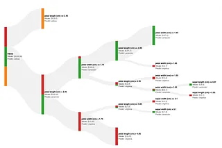
Interactively Prune a Decision Tree
Prune a decision tree in seconds with a Sankey diagram.
Apr 7
•
Avi Chawla
24
Share this post
Interactively Prune a Decision Tree
blog.dailydoseofds.com
Copy link
Facebook
Email
Note
Other
Automatically Profile Pandas DataFrame with AutoProfiler
...without writing any redundant code.
Mar 24
•
Avi Chawla
24
Share this post
Automatically Profile Pandas DataFrame with AutoProfiler
blog.dailydoseofds.com
Copy link
Facebook
Email
Note
Other
How to Create the Elegant Calendar Plot in Python?
A richer alternative to line plot.
Mar 3
•
Avi Chawla
54
Share this post
How to Create the Elegant Calendar Plot in Python?
blog.dailydoseofds.com
Copy link
Facebook
Email
Note
Other
3
Enrich Your Missing Data Analysis with Heatmaps
A lesser-known technique to identify feature missingness.
Feb 27
•
Avi Chawla
44
Share this post
Enrich Your Missing Data Analysis with Heatmaps
blog.dailydoseofds.com
Copy link
Facebook
Email
Note
Other
2
Use Box Plots with Caution! They Can Be Misleading.
...and here's how to prevent being misled by them.
Feb 16
•
Avi Chawla
79
Share this post
Use Box Plots with Caution! They Can Be Misleading.
blog.dailydoseofds.com
Copy link
Facebook
Email
Note
Other
2
Avoid Using PCA for Visualization Unless the CEV Plot Says So
Using variance as an indicator for visualization.
Feb 15
•
Avi Chawla
41
Share this post
Avoid Using PCA for Visualization Unless the CEV Plot Says So
blog.dailydoseofds.com
Copy link
Facebook
Email
Note
Other
4
The Coolest Plotly Feature That You Have Been (Possibly) Ignoring All This Time
Enrich static plots with animations.
Jan 11
•
Avi Chawla
91
Share this post
The Coolest Plotly Feature That You Have Been (Possibly) Ignoring All This Time
blog.dailydoseofds.com
Copy link
Facebook
Email
Note
Other
1
Sankey Diagrams: An Underrated Gem of Data Visualisation
A pretty useful plot which simplifies visualizing flow data.
Jan 4
•
Avi Chawla
136
Share this post
Sankey Diagrams: An Underrated Gem of Data Visualisation
blog.dailydoseofds.com
Copy link
Facebook
Email
Note
Other
4
Ridgeline Plots: An Underrated Gem of Data Visualisation
A pretty useful plot which simplifies data distribution visualization.
Dec 30, 2023
•
Avi Chawla
119
Share this post
Ridgeline Plots: An Underrated Gem of Data Visualisation
blog.dailydoseofds.com
Copy link
Facebook
Email
Note
Other
Share
Copy link
Facebook
Email
Note
Other
This site requires JavaScript to run correctly. Please
turn on JavaScript
or unblock scripts